Vancouver’s Premier Web Design Experts – Fresh, Bold, and Unrivalled!
We Create. You Succeed.
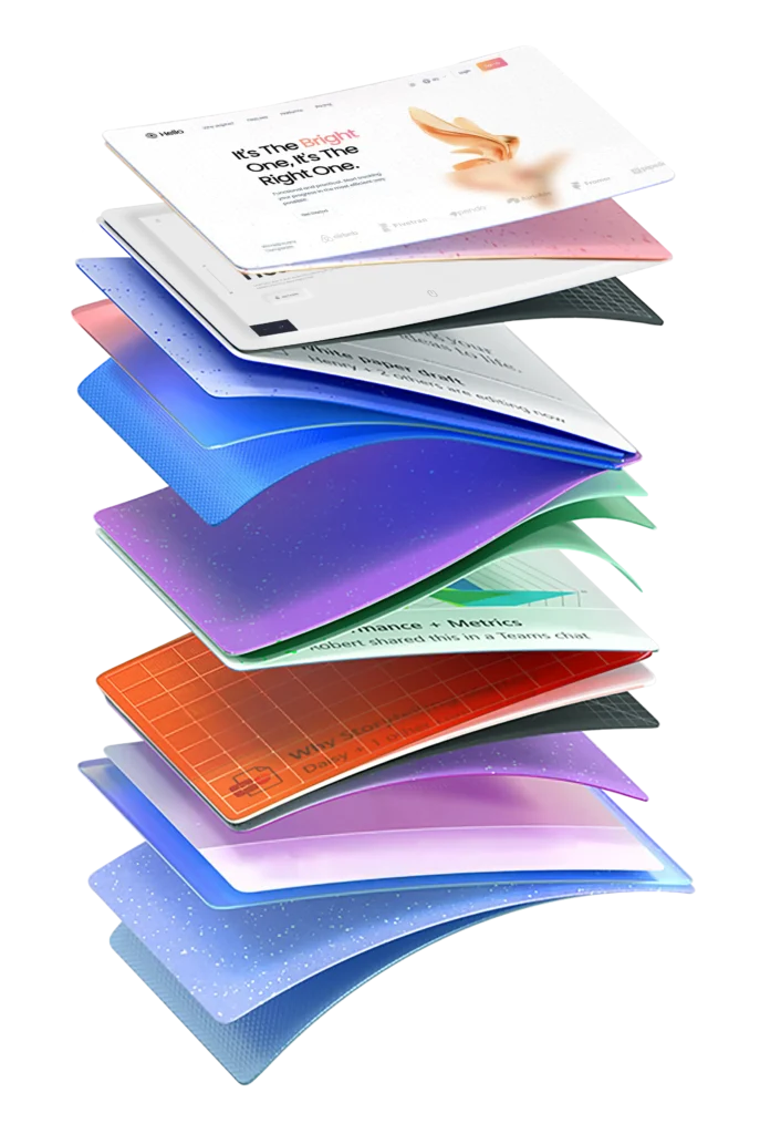
Looking for standout web design companies in Vancouver? Thinkster Digital leads the pack, delivering cutting-edge, sleek, high-impact websites that elevate your brand. Based in vibrant Vancouver, we specialize in modern designs that don’t just look good—they drive results. Whether you’re a local startup or an established business, our team builds digital experiences tailored to your goals. Let us craft a site that reflects Vancouver’s energy and takes your online presence to new heights!
Lifting brands, whether towering or tiny, to greatness!
The Journey
Taking you from wild ideas to epic launches!
1. Discovery Dive
Strategy Jam
01.
We dive headfirst into your brand — poking around, asking questions, and finding the good stuff others miss.
Those insights turn into a smart strategy that knows exactly where it’s going.
01.
Strategy Jam
We dive headfirst into your brand — poking around, asking questions, and finding the good stuff others miss.
Those insights turn into a smart strategy that knows exactly where it’s going.
2. Brainstorm Bonanza
Creative Blitz
02.
Ideas don’t trickle in here—they explode. Our Social Media Marketing Services turn fearless brainstorming and bold strategy into scroll-worthy campaigns.
These social media Services blend data, instinct, and storytelling to build strategies that are fun, focused, and built to win attention—and results.
02.
Creative Blitz
Ideas don’t trickle in here—they explode. Our Social Media Marketing Services turn fearless brainstorming and bold strategy into scroll-worthy campaigns.
These social media Services blend data, instinct, and storytelling to build strategies that are fun, focused, and built to win attention—and results.
3. Content Potion
Content Craft
03.
Brewed to perfection! We mix compelling words and eye-catching visuals to create content that captivates, connects, and converts. It’s not just about looking good; it’s about making magic happen—one irresistible piece at a time
03.
Content Craft
Brewed to perfection! We mix compelling words and eye-catching visuals to create content that captivates, connects, and converts. It’s not just about looking good; it’s about making magic happen—one irresistible piece at a time
4. Imagination Station
Thought Drop
04.
Hop on the creativity ride with Social Media Marketing Agencies Deccan—where bold ideas, quirky twists, and fearless thinking collide.
We craft scroll-stopping concepts with a dash of surprise and a lot of personality, making your brand impossible to ignore.
04.
Thought Drop
Hop on the creativity ride with Social Media Marketing Agencies Deccan—where bold ideas, quirky twists, and fearless thinking collide.
We craft scroll-stopping concepts with a dash of surprise and a lot of personality, making your brand impossible to ignore.
5. The Grand Makeover
Vibe Upgrade
05.
Your brand’s glow-up kicks off with Social Media Marketing Agencies in Deccan FC Road—where pixels get pampered and ideas get a personality upgrade.
Made for Deccan FC Road brands, this makeover keeps you quirky-cool, trend-savvy, and totally unmissable online.
05.
Vibe Upgrade
Your brand’s glow-up kicks off with Social Media Marketing Agencies in Deccan FC Road—where pixels get pampered and ideas get a personality upgrade.
Made for Deccan FC Road brands, this makeover keeps you quirky-cool, trend-savvy, and totally unmissable online.
6. Showtime Magic
Refined Reveal
06.
Drumroll, please—your brand takes center stage with social media marketing that launches loud, proud, and polished.
We unveil, amplify, and celebrate your presence, making sure all eyes (and clicks) stay locked on you.
06.
Refined Reveal
Drumroll, please—your brand takes center stage with social media marketing that launches loud, proud, and polished.
We unveil, amplify, and celebrate your presence, making sure all eyes (and clicks) stay locked on you.
We are experts in leading industry standard platforms & technologies.
Professional Advice
Have a question?
Whether you’re curious about our services, our process, or how we can help your business succeed, you’ll find the information you need right here.
The cost of website design in Vancouver typically ranges from 2,000to2,000to10,000+, depending on the complexity, features, and size of the project. Basic sites may cost less, while custom or e-commerce sites can exceed $10,000.
A standard business website takes around 2 to 4 weeks, while complex websites like eCommerce or custom platforms may take 6 to 12 weeks. Timelines depend on design revisions, content availability, and development complexity.
Yes! We build SEO-optimized websites with fast loading speed, mobile responsiveness, clean code, and best on-page SEO practices to help you rank higher on Google.
Absolutely! We create fully responsive websites that adjust perfectly to desktops, tablets, and mobile devices, ensuring a seamless user experience across all screen sizes.
Yes! We offer website maintenance services, including security updates, bug fixes, speed optimization, and content updates, to keep your website running smoothly.
Would you like more FAQs or customizations for specific services? 🚀
Looking for collaboration for your next project? Do not hesitate to contact me to say hello.


