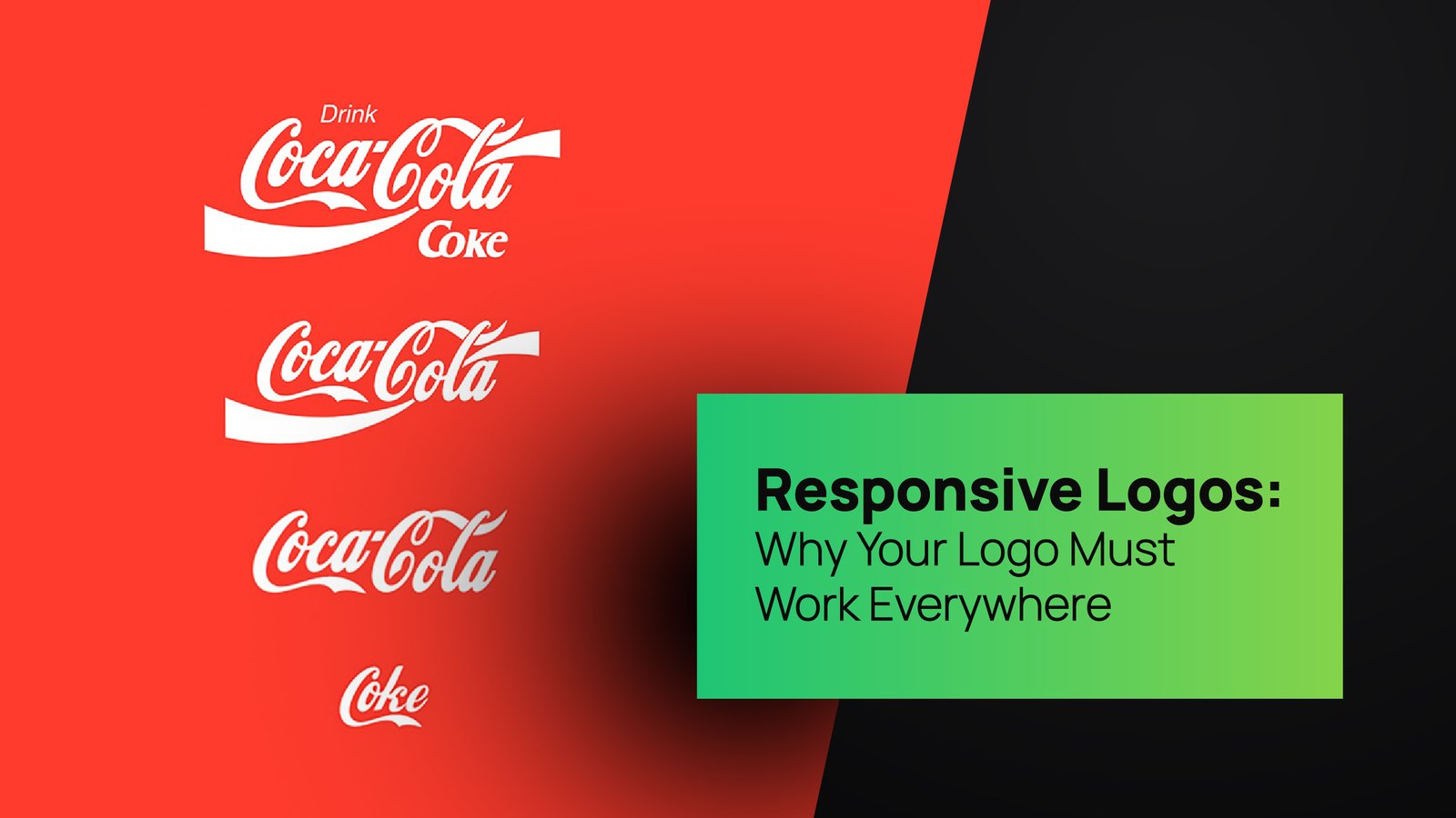
Logos are like brand selfies. They capture the essence of a company in one tiny, bold, and hopefully unforgettable frame. For years, the design world swore by the power of minimalism. Flat logos, muted palettes, and ultra-clean aesthetics were considered the holy trinity of modern design. But design, like fashion, has its cycles. Just as bell-bottoms found their way back into wardrobes and vinyl records returned to hipster shelves, design has resurrected a once-dismissed trend: gradients. Yes, Gradients in Modern Logos are back, and they are not just sneaking in quietly—they are strutting back onto the branding stage with the audacity of neon lights at a retro disco.
At Thinkster, we’ve been keeping a sharp eye on how branding evolves. Trends are never random; they’re shaped by cultural mood, consumer behavior, and a constant tug-of-war between nostalgia and novelty. The resurgence of gradients tells us a bigger story about how brands want to be perceived today—vivid, dynamic, and unapologetically bold. Gone are the days when flat was the only cool kid in the design class. The new cool is a rainbow, layered, textured, and bursting with personality.
The Gradient Comeback Nobody Saw Coming
For the longest time, gradients were considered “too much.” In the early 2000s, logo designers went wild with metallic sheens, bevel effects, and rainbow gradients that looked more like clipart experiments than professional design. That visual overload pushed the pendulum toward flat design, which became the industry’s savior. Simplicity ruled, and brands like Apple, Google, and Microsoft set the tone by embracing flat, single-color marks.
But culture never stays still. Over the past decade, technology evolved, screens became sharper, and digital experiences more immersive. Suddenly, gradients no longer looked cheap—they looked sophisticated. With tools and display capabilities catching up, Gradients in Modern Logos became sleek, vibrant, and purposeful rather than gaudy. Today’s gradients aren’t your 2005 rainbow explosions; they’re smooth, intentional color transitions in logos that add depth and richness without overwhelming the eye.
Bold Colors in Logos: Why Flat Alone Isn’t Enough

Minimalist logos with flat colors still have their place, but consumers now crave more vibrancy. Think about how we scroll through feeds today: Instagram, TikTok, YouTube—they’re all about movement, color, and emotion. In this high-speed, high-stimulation environment, flat logos sometimes fade into the background. That’s where bold colors in logos come charging in like a confetti cannon.
Gradients give brands a superpower: the ability to blend vibrancy with subtlety. A logo can start with electric pink and glide seamlessly into a deep violet, instantly creating a feeling of dynamism. These bold transitions do more than just look pretty; they make a brand memorable. Bold colors ignite emotions, and in branding, emotions equal connection.
At Thinkster, we help brands decode this psychology. When used strategically, a gradient can say, “We’re modern,” “We’re approachable,” or even “We’re here to shake things up.” Color choices are never random; they’re based on what you want your audience to feel. Which brings us to an underrated but crucial piece of this puzzle: logo color psychology.
Logo Color Psychology: More Than Meets the Eye
Colors speak a language of their own. Red screams urgency or passion. Blue calms, comforts, and builds trust. Yellow is cheerful, green signals growth, and purple whispers luxury. But what happens when these colors aren’t confined to single blocks and instead flow into each other? That’s where logo color psychology gets even juicier.
A gradient can tell a layered story. For example, a gradient that shifts from blue to green doesn’t just look sleek; it communicates trust that evolves into growth. A fiery gradient moving from orange to red signals creativity bursting into boldness. These color transitions in logos allow brands to play with multiple emotions at once, making the visual experience richer.
Psychologically, gradients also mimic real-world lighting and depth, which the brain interprets as more dynamic and engaging. In other words, your audience doesn’t just “see” your logo—they feel it. And in today’s branding wars, where a thousand startups scream for attention daily, making people feel something is half the victory.
Branding with Gradients: Beyond the Logo

One of the reasons Gradients in Modern Logos are staging a triumphant return is their adaptability. Branding today isn’t about a single static logo—it’s about systems. A logo must live on apps, websites, merch, billboards, and even tiny smartwatch screens. Gradients give brands a playground of possibilities.
Think about Spotify’s shifting green-to-blue palettes, Instagram’s iconic pink-orange-purple blend, or the way fintech startups use blue-to-teal gradients to feel fresh yet trustworthy. These aren’t accidents; they’re calculated examples of branding with gradients. A strong gradient palette allows brands to extend their identity across visuals, social campaigns, packaging, and even motion graphics without feeling stale.
At Thinkster, we often tell clients: your brand is not just a stamp, it’s an experience. Gradients help that experience feel alive. A flat blue may be calming, but a gradient moving from turquoise to deep navy feels like a journey—one that consumers want to join.
Modern Logo Design Trends: The Rise of Fluidity
If the 2010s were about clean, flat design, the 2020s are about fluidity. Static is out, dynamic is in. This is why modern logo design trends are leaning heavily toward flexibility, movement, and adaptability. Gradients fit perfectly into this ethos because they are inherently fluid—they suggest transformation and flow, which is exactly what brands want to communicate in a world that evolves daily.
Think about how logos now appear in motion graphics, app icons, and interactive websites. Gradients not only look stunning in still form but also animate beautifully, adding depth and energy to digital storytelling. No wonder we’re seeing tech companies, lifestyle brands, and even luxury players embracing gradients like never before.
Brands that once swore by flat logos are rethinking their stance. Google added subtle gradients to its Workspace icons, Instagram’s gradient remains a cultural icon, and even stodgy financial companies are experimenting with transitions. The message is clear: if you’re not playing with gradients, you’re missing out on one of the biggest shifts in branding.
Why Thinkster Loves Gradients (and You Should Too)

Here’s where we bring it home: design isn’t just about being trendy—it’s about being strategic. At Thinkster, we don’t chase fads, we decode movements. The return of gradients isn’t a passing whim; it’s a reflection of how audiences connect with brands today.
Gradients in Modern Logos embody what people want: vibrancy, energy, and authenticity. They give brands room to experiment while staying recognizable. And let’s be real: in a sea of flat sameness, a well-crafted gradient can make your logo pop like a jalebi on a white plate—it’s irresistible.
We’ve worked with startups that wanted to shed their corporate stiffness and adopt a friendlier persona. A gradient solved that in seconds. We’ve guided heritage brands looking to modernize without losing gravitas—gradients allowed them to look fresh without seeming faddish. When done right, gradients aren’t just pretty; they’re powerful business tools.
So, if you’re still holding on to the flat design era, it may be time to loosen that grip. The future is layered, dynamic, and delightfully colorful. And Thinkster is here to make sure your brand doesn’t just keep up but stands out.
Conclusion: The Future Is Gradient
The return of gradients signals more than just a design revival; it’s a cultural reset. Flat logos may have defined an era, but now the pendulum swings toward vibrancy. Bold colors in logos are back to reclaim attention, logo color psychology is expanding with new depth, and modern logo design trends are leaning into fluidity. Branding with gradients gives companies a toolkit to stay dynamic, fresh, and connected in a fast-paced digital landscape.
At Thinkster, we like to say branding is part art, part science, and part daring experiment. Gradients capture all three. They’re artistic in their beauty, scientific in their psychological impact, and daring in their ability to stand out.
So, as you look at your logo and branding today, ask yourself: does it whisper quietly, or does it sing in color? If it’s the former, maybe it’s time for an upgrade. Because make no mistake—the future belongs to brands brave enough to embrace gradients in modern logos.


