Welcome to the world of logo color wizardry — where your brand’s first impression might just be a shade more important than you think. At Thinkster, we like to say: your logo speaks before your brand even gets to clear its throat. And guess what it’s speaking in? Fluently, confidently… in color.
Whether you’re a peppy startup, a cool cat in SaaS, or a legacy brand in need of a glow-up, your logo isn’t just a graphic stamp. It’s the emotional handshake, the visual drumroll, the “hello world” in hexadecimal hues. And behind all those pops of red, cool blues, and moody greys lies the often-underestimated realm of color theory for logos.
So let’s uncap those Pantones and dive deep into what your palette actually says about you.
Why Color Theory for Logos Isn’t Just Designer Nonsense
Designers might throw around terms like CMYK and color wheels with the fervor of a pizza chef discussing mozzarella stretch—but this isn’t just art-school babble. Color theory for logos is grounded in psychological science and marketing data. The colors you choose don’t just look good—they feel good. Or calm. Or urgent. Or trustworthy.
Thinkster has worked with hundreds of brands who didn’t realize their pale blue logo was whispering when it should’ve been roaring. Or that their cheerful yellow was, in fact, causing low readability on digital screens (yikes). Color theory ensures your brand not only makes sense but makes cents—because conversions start with perception.
Logo Color Psychology: Your Brand Therapist in Disguise
Let’s break it down like a Thinkster strategist on their third cup of coffee:
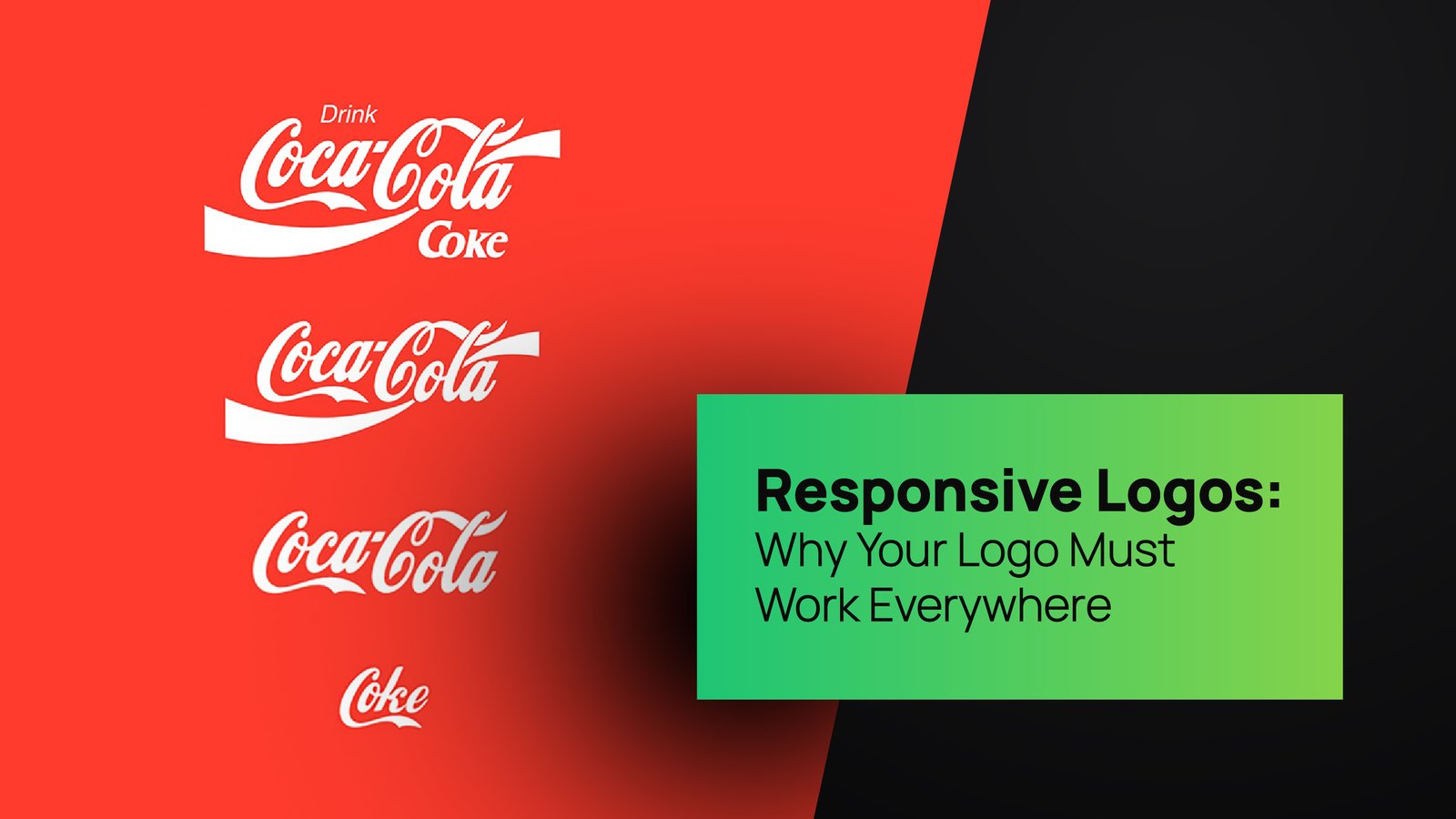
- Red says passion, urgency, power. It’s bold, energetic, and best served to brands who want attention—now. Think Coca-Cola or YouTube.
- Blue says trust, reliability, calm. It’s the golden retriever of colors. You’ll see it in finance, SaaS, healthcare—where trust is oxygen.
- Yellow screams optimism and creativity, but go too bright and it becomes “annoyed emoji” energy.
- Green leans into growth, health, sustainability. A favorite among eco-brands and fintechs alike.
- Black is classy, mysterious, premium. Also used when a brand doesn’t want to age (Chanel, Apple).
- Purple gives off luxury and creativity, like a brand that drinks lavender lattes and writes poetry.
That’s logo color psychology in action. Not guesswork—strategy.
At Thinkster, we make sure your brand isn’t giving mixed signals. You say you’re trustworthy, but your logo is red and black? Uh-oh. Let’s chat.
Brand Color Meanings: Decode Your Brand’s Personality

Branding isn’t just about looking good. It’s about meaning—which means your logo’s colors are extensions of your brand’s personality. Every hue has a history. Every shade has baggage. Yes, brand color meanings are a thing.
That calming blue? It’s been associated with safety for centuries (hello, police uniforms and life jackets). That fiery red? It’s evolutionary—our brains are wired to notice red first. That’s why red “Buy Now” buttons outperform others.
Thinkster’s branding team often works backward. Instead of picking colors based on what’s trending, we start with who you are. Are you a disruptor? An empathic innovator? A thought leader in a suit? Your palette should match.
Remember: you wouldn’t wear neon green to a funeral. Don’t let your logo do it either.
The Art & Science of Logo Color Combinations
You’re not just picking a color. You’re picking a symphony. This is where logo color combinations come in—and they’re trickier than mixing drinks at a startup party.
Let’s say your main brand color is blue. What accent colors bring it to life? What contrast ratio keeps it accessible? How does it look in dark mode?
You’ve probably seen:
- Analogous combinations (like red-orange-yellow): harmonious, great for warm, upbeat brands.
- Complementary pairs (like blue and orange): visually striking, energetic, great for tech and sports.
- Monochromatic styles (varying shades of the same color): minimalist, modern, perfect for luxury.
But the real sauce comes from strategic pairing. At Thinkster, we don’t just throw colors at a wall. We use data, emotion, industry benchmarks, and sometimes, sheer chromatic audacity.
If your current logo looks like it was colored using MS Paint at midnight, let’s fix that.
Color Symbolism in Branding: More Than Just Pretty Pixels

You might think pink just screams Barbie. But in Japan, pink symbolizes masculinity. In Korea, white is worn at funerals. So yes—color symbolism in branding isn’t universal.
Brands going global? Pay attention.
Thinkster worked with a beauty brand entering Southeast Asia. Their original lavender packaging felt elegant in Paris. In Bangkok? It read “cheap detergent.” After tweaking their palette to a deep coral and pearl combo, their perception flipped overnight. Sales? Up 22%.
That’s the power of symbolism.
Culturally aware, psychologically tested, and emotionally aligned palettes are where your brand story really sticks.
Best Colors for Logos (Spoiler: There’s No One-Size-Fits-All)
Let’s debunk a myth: there’s no master list of best colors for logos.
Yes, blue dominates industries like finance and tech. Red rules fast food. Black slays in fashion. But that’s correlation, not causation.
You could absolutely own a hot pink fintech brand. But it better be intentional. It better scream confidence. And it better be tested across digital platforms, print, signage, and swag.
At Thinkster, we run your logo through our “Chromatic Gauntlet.” It includes:
- Emotional perception tests
- Digital readability audits
- Cultural filters
- Industry differentiation mapping
If your logo passes that test, congrats. If not, it’s back to the color lab.
Color Consistency: The Unsung Hero of Brand Recognition
Ask anyone to draw the McDonald’s logo. They may forget the curve—but they’ll nail that yellow and red. That’s the power of color consistency.
Using different shades of green across your packaging, social media, and website? Rookie move.
At Thinkster, we enforce “palette discipline.” We lock your colors in a brand style guide, give you HEX, RGB, CMYK, Pantone… and probably a therapist if you ever try to change them impulsively.
Consistency builds recognition. Recognition builds trust. Trust builds sales.
Logo Color Mistakes to Avoid (And Yes, We’ve Seen Them All)

Oh, the horror stories.
- A wellness brand using electric red and black. Result? Looked like a gym that sells steroids.
- A vegan café logo in brown and grey. Translation? Sad lettuce vibes.
- A luxury skincare line in neon green and orange. Not even Gen Z could save that combo.
Every color choice tells a story. If it’s not yours, it’s probably a confusing one.
Thinkster’s Logo Color Philosophy: We Make You Pop Without Screaming
Here at Thinkster, we don’t just give you a logo—we give you a color story. One that gets your audience, your goals, your culture, your chaos. Our branding team lives at the intersection of psychology, design, and marketing. And yes, we nerd out over gradients.
Our process?
- We dig into your brand DNA.
- We analyze your competitors’ palettes.
- We test dozens of color combinations.
- We drink a lot of coffee.
- We deliver a logo and color system that actually says something.
Whether you’re launching a fintech app, a sustainable D2C brand, or the next great AI startup—your logo deserves more than just a lucky guess with the color picker tool.
Ready for a Color Intervention? Let Thinkster Paint the Town With Your Brand
Still using that outdated teal from 2012? Still unsure why your bold orange isn’t converting clicks? Still wondering if your color palette screams “we don’t know what we’re doing”?
It’s time to talk to Thinkster.
We bring branding brains, digital expertise, and color therapy—all rolled into one stylish package. Let us transform your logo into a visual magnet with real strategy behind the spark.
Color theory for logos isn’t optional. It’s the silent salesperson for your brand—and trust us, ours don’t just sell. They convert.
Final Swatch
Your brand isn’t black and white (unless that’s your actual palette). It’s layered, emotional, and strategic—and your logo colors need to match that energy. So, if your brand is still going through a quarter-life palette crisis, don’t just throw in any color.
Call in the Thinksters. We’ll find the perfect hue for you.
Let’s get colorful — on purpose.