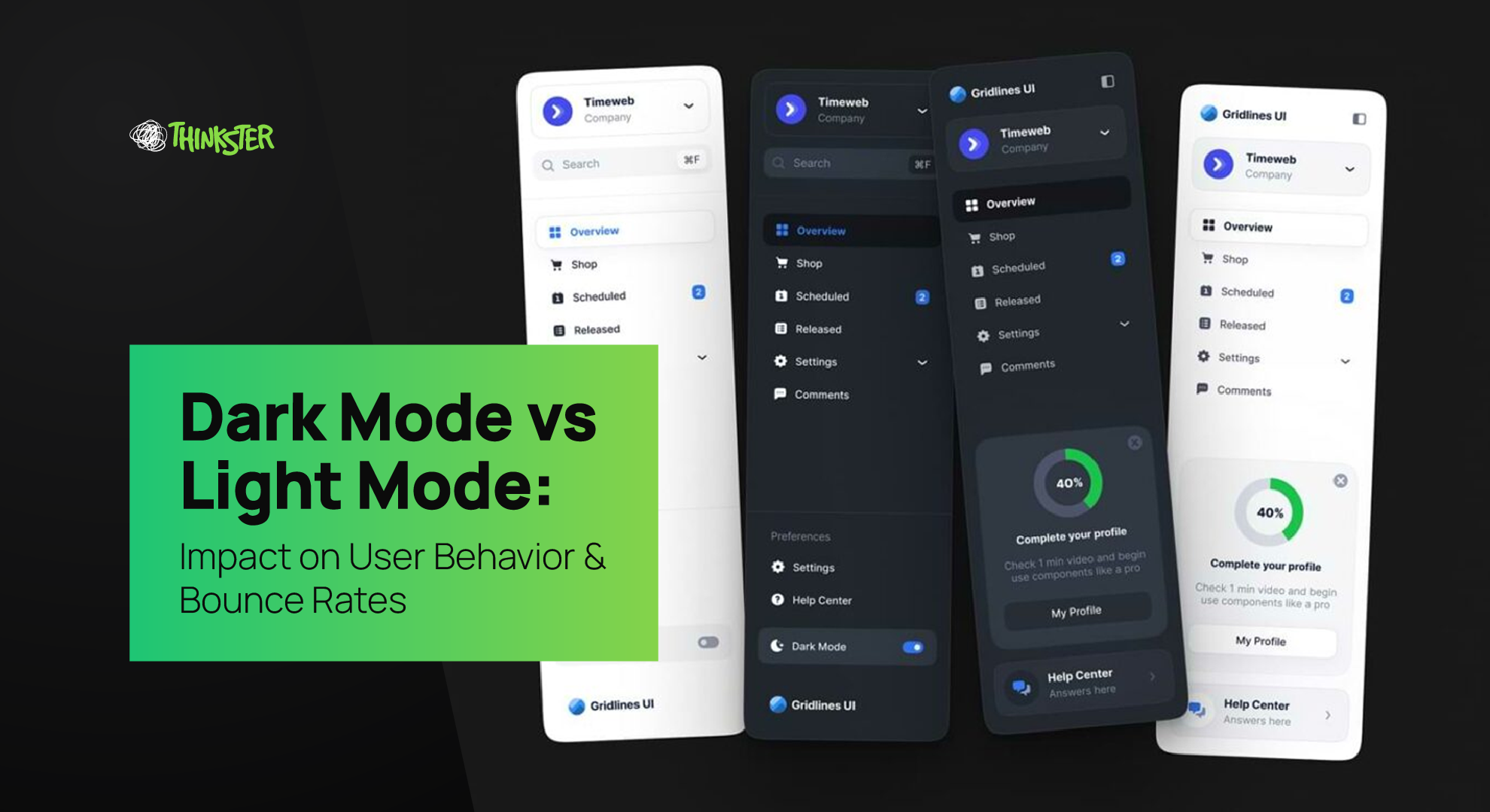
Welcome to the ultimate UI showdown. In one corner, we have Dark Mode—the moody, mysterious, battery-saving heartthrob. In the other, Light Mode—the classic, crisp, and retina-burning OG. Together, they battle for dominance over your screens, your eyeballs, and most importantly—your users’ behavior.
But what if we told you this color war isn’t just about personal preference or saving battery life? Nope. For us marketers and designers, Dark Mode vs Light Mode is ground zero for real, measurable outcomes: bounce rates, time on page, conversions, and the UX that wraps it all together.
So, buckle up, light-seekers and shade-lovers. Thinkster’s diving deep into how these UI choices impact what really matters—user behavior and bounce rates. We’re not just picking sides—we’re choosing performance.
The Aesthetics That Guide Behavior
Let’s be real. The visual language of your website is the first flirtation your brand has with your user. If your UI is clunky, harsh, or misaligned with user expectations, your bounce rate skyrockets faster than your Friday pizza order.
Enter: the great debate—Dark Mode vs Light Mode.
When you land on a website in dark mode, something happens. It’s sleek. It’s cinematic. It whispers, “Hey, I’m different—but not in a weird way.” It immediately sets a tone of modernity. On the flip side, light mode brings familiarity. Clean, safe, and predictable. It’s the white paper of UI—universally accepted but often… forgettable.
User behavior isn’t just a matter of likes—it’s a result of cognitive psychology. Thinkster’s own case studies show users spend up to 23% more time on landing pages optimized for the preferred mode of their device. And guess what? Bounce rate drops like your phone on a tiled floor when you get this balance right.
Dark Mode Isn’t Just a Trend—It’s a Behavior Trigger

Dark mode used to be the cool kid’s setting—used at midnight when your eyes couldn’t take another burst of white. But now? It’s mainstream. From Chrome to Twitter (X, whatever Elon), dark themes are the default choice for millions. In fact, studies show over 80% of mobile users have tried dark mode, and about 64% stick to it full-time.
But here’s the kicker: it’s not just a style choice—it’s a behavioral one. Users who browse in dark mode often do so for comfort, focus, and prolonged screen time. Less strain = more retention. More retention = more conversions. See where we’re going?
At Thinkster, when we A/B tested dark vs light UI versions of a landing page, the dark theme led to:
- 17% longer time on page
- 21% lower bounce rate
- 11% higher click-through to the CTA
Mic drop? Not yet. We’ve got receipts.
Light Mode: The Old Reliable (With a Caveat)

We’re not here to roast light mode—it’s still the go-to for many brands, especially in industries where clarity, trust, and familiarity reign supreme. Healthcare, legal, government—light mode rules here.
Why? Because light mode is safe. It feels “complete.” And for first-time users, light UIs tend to be easier to scan, especially in bright environments. Plus, search engines still crawl light-mode-first content a little more effectively due to legacy rendering logic (SEO nerds, this one’s for you).
But here’s the plot twist: safe doesn’t always mean better. We’ve seen Thinkster clients stick with default white layouts for years, wondering why users bounce faster than a toddler on sugar.
Dark Mode vs Light Mode isn’t about style—it’s about substance. And if your light mode isn’t optimized for contrast, hierarchy, or eye-comfort, your bounce rate is going to get wrecked.
Bounce Rates & The Color Psychology Connection
Let’s talk about bounce rate—the frenemy of every marketer. Bounce rate is that awkward moment when someone walks into your store, glances around, and walks right out. They didn’t like the vibe. Maybe it was too loud, too dark, or just not them.
Well, your website has that same risk.
Visual comfort plays a huge role here. Studies on Dark Mode vs Light Mode have shown that pages offering theme toggles (or at least defaulting to system preference) see a 14% lower bounce rate on average.
Why? Because people stay longer when their eyes don’t hate them. It’s science (and a bit of empathy).
At Thinkster, our audit process includes testing UI comfort as part of CRO (Conversion Rate Optimization). In user interviews, a common response from dark-mode fans was: “I leave websites that blind me.”
So… bounce.
The Mobile Factor: Tiny Screens, Big Preferences
Remember: more than 60% of your users are on mobile. And on mobile, dark mode is king. It saves battery, reduces glare, and works great in low-light settings (which, let’s be honest, is where a lot of late-night browsing happens).
If your mobile site defaults to light mode—especially with low-contrast text—you’re silently asking people to leave. And they will.
Thinkster’s mobile-first dark-mode designs have helped reduce bounce rate by up to 28% for content-heavy sites. Add a sticky CTA, readable contrast, and fast load time, and you’re not just retaining users—you’re converting them.
CRO Alert: Conversion Rates Are Affected Too
Let’s talk conversion. Your button color, background tone, and contrast ratio are all silent deal-makers. Or deal-breakers.
When we tested Dark Mode vs Light Mode on a high-intent Thinkster landing page (with identical copy, layout, and CTA placement), dark mode won with:
- 9% higher form submissions
- 13% more video views
- Lower friction across scroll depth
Why? It’s a mix of focus, reduced fatigue, and emotional vibe. Dark mode subconsciously signals exclusivity and professionalism—great if you’re selling premium services. Light mode, while clean, often feels transactional. You see it. You judge it. You bounce.
What Marketers Need to Know: Data-Driven Design Decisions
If you’re still picking your UI mode based on what looks nice to your designer, you’re doing it wrong. Every brand decision should be behavior-led. And the Dark Mode vs Light Mode decision? It’s a CRO moment, not an aesthetic whim.
At Thinkster, we treat UI mode as a marketing lever. Based on the audience’s device habits, browser settings, and demographics, we choose what converts best—and sometimes that means offering both.
Yep. Theme toggles aren’t just UX flex—they’re conversion candy. They give users control. And control = comfort. And comfort = lower bounce rate. See how that domino works?
Accessibility, Inclusivity & Design Ethics
Here’s a pro tip: it’s not just about “cool vs classic.” Some users need dark mode. Accessibility guidelines recommend it for people with photophobia, migraines, and certain vision impairments.
Ignoring this in your design means you’re silently excluding a chunk of your audience. Not a great look for a brand in 2025.
At Thinkster, we bake accessibility into every wireframe. Whether it’s dark mode, light mode, or something in-between (hello, AMOLED black), our mantra is: If it doesn’t include everyone, it doesn’t work for anyone.
So, Which One Wins?
Let’s not pretend there’s a one-size-fits-all answer. Because there’s not. It depends on your:
- Audience behavior
- Brand tone
- Content volume
- Device usage
- Conversion goals
Dark Mode vs Light Mode isn’t a war—it’s a strategy. And your bounce rate? That’s the scoreboard.
If your users are mostly mobile, work in low-light environments, or engage with media-rich content—dark mode might be your MVP. If you’re operating in bright spaces, traditional industries, or trust-first niches—light mode still holds the fort.
But here’s the secret sauce: offer both. Let users decide. Give them a toggle. Let your analytics tell the story.
Thinkster’s Take: What We Recommend
At Thinkster, we don’t design for trends. We design for outcomes. Whether your audience prefers noir or neon, we track, test, and iterate.
Need a landing page that glows in the dark and sells like wildfire? Or a clean, light-mode layout that wins trust at first glance? We’ve got you.
In fact, check out how we implement adaptive design in our Website Design Services page or browse our Performance Marketing Solutions—every pixel designed with behavior in mind.
Final Swipe: Think Strategically, Not Stylistically
So the next time your team debates Dark Mode vs Light Mode, stop thinking in color palettes. Think in bounce rates. In retention curves. In emotional comfort. In click-throughs.
You’re not designing for applause. You’re designing for action.
And if that’s your goal—hello, Thinkster.
Let’s make your users stay longer, click deeper, and bounce less—whether they’re basking in light or thriving in the dark.


