Every year, Pantone drops its Colour of the Year like a cultural mic drop. Designers pause. Marketers panic-scroll Pinterest. Brands everywhere quietly update mood boards they swore were “final.”
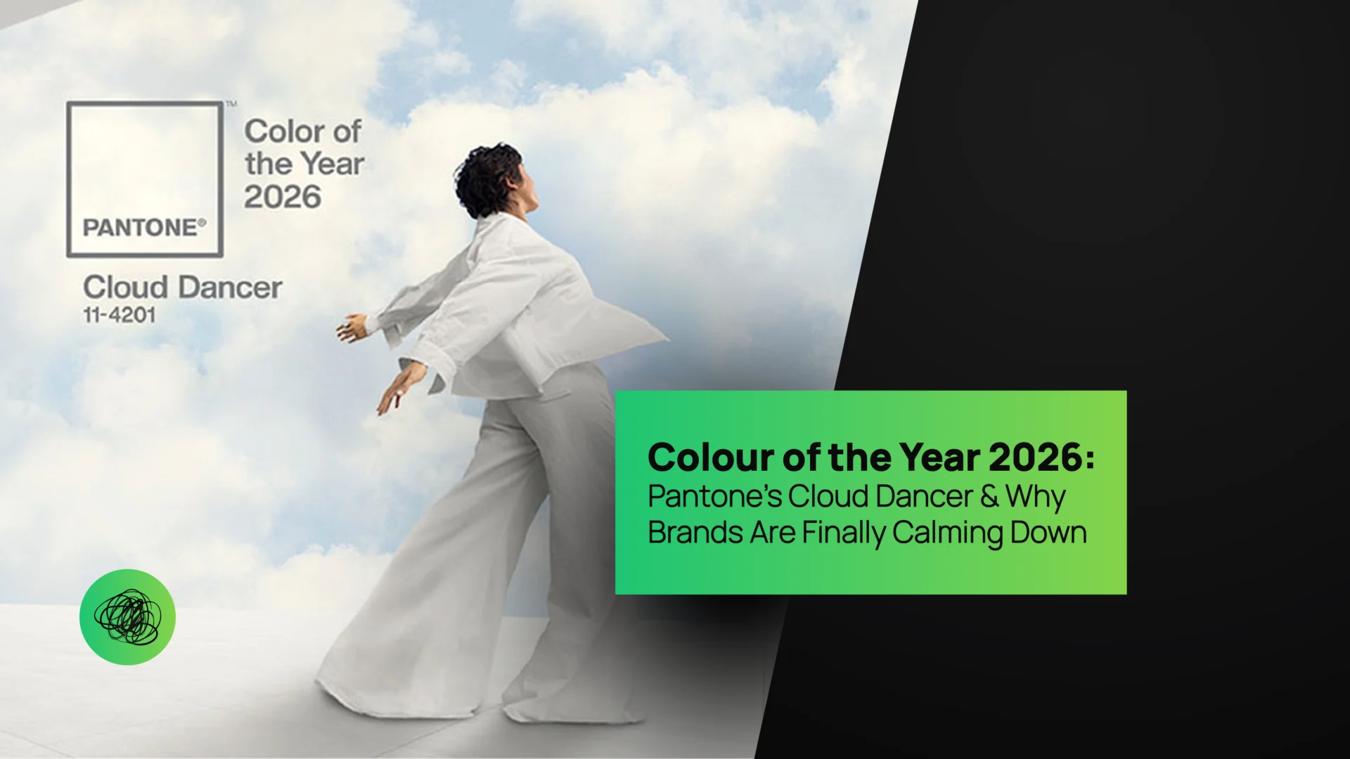
And for Colour of the Year 2026, Pantone didn’t go loud, neon, or outrageously experimental. Instead, it chose something far more disruptive in today’s attention-hungry world — Cloud Dancer.
Yes, Cloud Dancer.
Soft. Airy. Calm. Confidently understated.
In a world screaming for attention, Pantone picked a colour that whispers — and somehow still commands the room.
In this blog, we break down Colour of the Year 2026, what Cloud Dancer really means for brands, how it ties into minimal design trends 2026, and why this shade is secretly rewriting modern marketing strategies using pure psychology (and zero chaos). And of course, we’ll tell you how to use it without your brand looking like a meditation app from 2014.
Welcome to branding therapy. Thinkster style.
What Is the Colour of the Year 2026? Meet Cloud Dancer
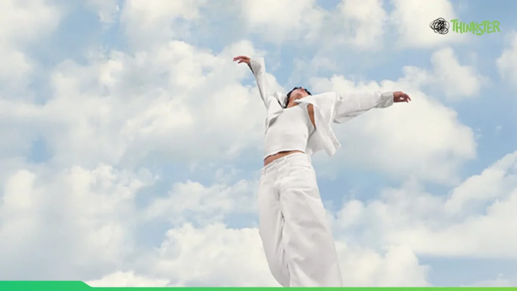
Pantone’s Colour of the Year 2026 — Cloud Dancer — sits somewhere between a soft off-white, pale grey, and airy neutral. It’s not cold. It’s not sterile. And it’s definitely not boring.
Think early morning sky.
Think freshly steamed linen.
Think calm confidence without trying too hard.
Cloud Dancer isn’t about shouting innovation. It’s about design maturity.
Pantone’s choice reflects a massive cultural shift: consumers are tired. Not physically — emotionally. We’ve lived through visual overload, aggressive branding, high-contrast chaos, and dopamine-heavy design systems. Cloud Dancer says, “You don’t need to scream to be heard.”
And honestly? Brands needed that reminder.

Why Pantone’s Colour of the Year 2026 Makes So Much Sense Right Now
If previous years were about bold self-expression and maximalist rebellion, Colour of the Year 2026 is about emotional regulation.
Cloud Dancer lands at the exact moment when:
• Consumers crave simplicity
• Brands want longevity, not virality
• Minimalism is evolving from “clean” to “comforting”
• Trust matters more than trends
This colour doesn’t compete for attention — it creates space for it.
From UX design to packaging to digital branding, Cloud Dancer reflects the world’s need for pause. And that makes it incredibly powerful for modern marketing strategies that focus on clarity, trust, and emotional connection instead of clickbait chaos.
Cloud Dancer & the Rise of Minimal Design Trends 2026
Minimalism isn’t new. But minimal design trends 2026 aren’t about emptiness — they’re about intention.
Cloud Dancer fits perfectly into this evolution.
Earlier minimal design was sharp, black-and-white, ultra-contrast. In 2026, minimalism becomes warmer, softer, more human. Cloud Dancer acts as a neutral hero — letting typography, messaging, motion, and content breathe without disappearing into the background.
Designers aren’t using Cloud Dancer to fade away. They’re using it to frame meaning.
Websites feel calmer. Packaging feels premium. Interfaces feel less aggressive. Everything feels designed for humans, not algorithms.
And trust us — users notice.

Colour Psychology in Marketing: Why Cloud Dancer Works Emotionally
Let’s talk psychology — because colour psychology in marketing is where Cloud Dancer quietly dominates.
Soft neutrals like Cloud Dancer trigger feelings of:
• Safety
• Clarity
• Balance
• Reliability
• Emotional ease
In branding, this translates to trust acceleration. When a consumer encounters a brand using Cloud Dancer thoughtfully, their brain relaxes. And relaxed brains make better decisions (and conversions).
This is especially powerful for industries like:
• SaaS
• Healthcare
• Finance
• Wellness
• Education
• Premium D2C brands
Cloud Dancer reduces friction. It doesn’t distract. It doesn’t overwhelm. It creates emotional breathing room — which is gold in marketing.
Soft Design Trends Are Taking Over — And Cloud Dancer Leads the Way
If there’s one thing dominating visual culture right now, it’s soft design trends.
Rounded corners.
Subtle shadows.
Gentle gradients.
Low-contrast palettes.
Cloud Dancer fits seamlessly into this movement. It’s the perfect base colour for interfaces that feel approachable instead of intimidating.
Soft design trends aren’t about being boring — they’re about being kind. And in 2026, kindness is premium.
Brands using Cloud Dancer effectively don’t look weak. They look confident enough to slow down.
Cloud Dancer in Branding: Calm Is the New Cool
Aggressive branding had its moment. Loud colours, bold fonts, maximalist layouts — all designed to grab attention at any cost.
But Colour of the Year 2026 signals a shift. Calm is now the differentiator.
Cloud Dancer works best when paired with:
• Confident typography
• Intentional whitespace
• Thoughtful motion design
• Purpose-driven messaging
It doesn’t replace brand personality — it amplifies it.
At Thinkster, we’re already seeing brands use Cloud Dancer to elevate their identity from “trying hard” to “quietly iconic.”

Modern Marketing Strategies Are Moving From Noise to Nuance
Here’s the truth most brands don’t want to hear: shouting doesn’t work anymore.
Modern marketing strategies in 2026 are about relevance, resonance, and restraint. Cloud Dancer supports this shift by creating visual environments that feel trustworthy, premium, and emotionally intelligent.
In performance marketing, this colour improves readability and focus. In content marketing, it enhances storytelling. In UX, it reduces bounce rates by lowering cognitive load.
Cloud Dancer doesn’t sell harder — it sells smarter.
How Brands Can Use the Colour of the Year 2026 Without Looking Generic
Important disclaimer: slapping Cloud Dancer everywhere doesn’t automatically make your brand modern.
The key is contrast and context.
Use Cloud Dancer as:
• A primary background, not the only colour
• A neutral base paired with strong accent tones
• A canvas for bold messaging
• A mood-setter, not the hero
When paired with deep charcoals, muted blues, earthy greens, or confident typography, Cloud Dancer feels intentional — not bland.
Design maturity isn’t about trends. It’s about knowing when to step back.
Cloud Dancer in Digital Design: UX, Websites & Interfaces
In digital spaces, Colour of the Year 2026 shines brightest.
Websites built with Cloud Dancer feel faster, cleaner, and more premium — even if the backend isn’t revolutionary. The colour enhances perceived performance and usability.
Cloud Dancer improves:
• Readability
• Scroll comfort
• Visual hierarchy
• Focus on CTAs
This is colour psychology in marketing doing the heavy lifting — quietly guiding user behaviour without manipulation.
Packaging, Print & Physical Branding with Cloud Dancer
In physical branding, Cloud Dancer signals quality.
Packaging using this shade feels minimal but intentional. It suggests sustainability, care, and confidence. When paired with textured materials or subtle finishes, it elevates even the simplest product.
In print, Cloud Dancer reduces visual noise and allows messaging to take centre stage — a refreshing change in an overdesigned world.

Why Cloud Dancer Is a Long-Term Colour, Not a One-Year Trend
Some Pantone colours burn bright and fade fast. Colour of the Year 2026 is different.
Cloud Dancer isn’t seasonal. It’s foundational.
It works across industries. It adapts to evolving design systems. And most importantly — it won’t look dated next year.
Brands that adopt Cloud Dancer thoughtfully aren’t chasing trends. They’re building timeless visual equity.
Thinkster’s Take: Cloud Dancer Is for Brands That Have Grown Up
At Thinkster, we don’t believe trends should dictate identity. But we do believe Colour of the Year 2026 reflects something deeper — a collective move toward clarity, calm, and confidence.
Cloud Dancer isn’t for brands that need attention.
It’s for brands that already have it.
When used strategically, it becomes a powerful tool in modern marketing strategies, a masterclass in colour psychology in marketing, and a defining element of minimal design trends 2026.Soft doesn’t mean silent.
Calm doesn’t mean weak.
And Cloud Dancer proves that sometimes, the most powerful move is to breathe — and let your brand speak for itself.


