Picture this: you’ve loaded up your online cart with three quirky mugs, a book you don’t really need but suddenly must have, and a late-night impulse buy of scented candles that scream “new personality era.” You’re ready to checkout, and then—bam! The dreaded checkout form. Suddenly it’s asking for your life history, your pet’s birthday, and whether you want to sign up for twelve newsletters you never asked for. Your enthusiasm plummets faster than a chai cup slipping from sweaty hands in Ahmedabad heat. This, my friend, is the dark side of ecommerce: checkout friction.
At Thinkster, we believe checkout pages are the unsung heroes—or villains—of ecommerce. They decide whether a customer completes their journey with confetti or abandons the cart in frustration. That’s where Checkout Page Optimization comes in, a not-so-sexy term that quietly fuels billion-dollar conversions. But let’s dig deeper into the Psychology of Checkout Pages to understand why some flows feel like silk sarees gliding and others feel like walking barefoot on Lego.
Why Psychology Matters More Than Pixels
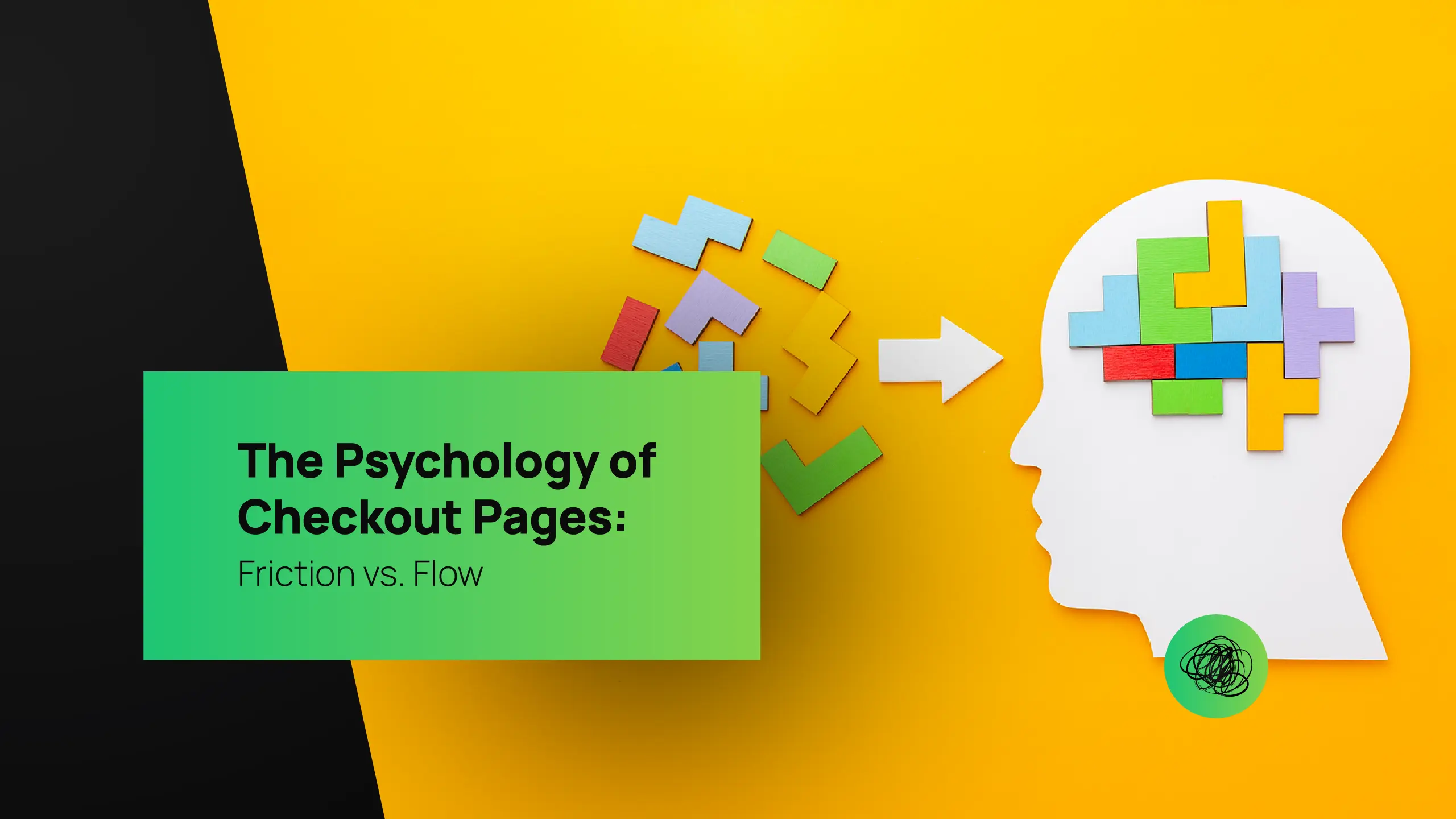
The Psychology of Checkout Pages isn’t just about form fields, dropdowns, or whether the “Buy Now” button is red or green. It’s about human behavior—how our brains perceive effort, risk, and reward at the exact moment of transaction. Every tiny hiccup is registered as “friction,” and every smooth step registers as “flow.” The science of ecommerce lives at this very crossroad of Friction vs Flow in Ecommerce.
Think of it as digital hospitality. If your checkout page feels like a friendly cashier waving you through with a smile, you’re golden. But if it feels like a grumpy bank clerk asking you to fill ten forms in triplicate, you’ve lost the sale. And customers today, whether in Ahmedabad, Amsterdam, or Alabama, are ruthlessly efficient. They don’t wait around for clunky checkout experiences. They’re here for speed, trust, and convenience. That’s where User Experience in Checkout becomes make-or-break.
Friction: The Silent Sales Killer

Let’s be brutally honest—checkout friction is the silent killer of online sales. You could have the slickest website, the funniest social media presence, or even the most dramatic influencer campaign, but if your checkout drags, customers bounce. High shipping costs, mandatory account creation, endless form fields, or surprise fees—these are the checkout equivalent of potholes on Gujarat highways.
At Thinkster, we call it “Death by a Thousand Clicks.” Each extra second or field chips away at customer trust and patience. And no, asking customers to type in their billing address again when they already gave it for shipping isn’t “safety,” it’s just bad UX. That’s why Reduce Checkout Friction isn’t a suggestion—it’s a survival tactic.
Flow: The Secret Ingredient of Ecommerce Happiness
Now let’s talk flow. In ecommerce, flow is that sweet spot where checkout feels so effortless the customer barely realizes they’ve paid. Amazon’s one-click checkout didn’t just revolutionize online shopping—it rewired how our brains expect online payments to work. The smoother the Ecommerce Checkout Experience, the higher the conversion.
A seamless flow leverages psychology. Autofilled fields reduce effort. Progress indicators reassure users. Multiple payment options cater to personal preferences. Trust badges whisper “we’ve got your back.” All these cues tell the customer: relax, this transaction is safe, easy, and worth completing. That’s why brands that master Checkout Page Optimization see not just higher conversions but happier repeat customers.
The Battle Between Friction and Flow
Every checkout page is a battleground between friction and flow. It’s almost poetic. Friction represents doubt, resistance, the tiny annoyances that snowball into abandonment. Flow represents trust, ease, and satisfaction. Customers may forgive a slightly confusing homepage or even a clunky product filter, but checkout is sacred territory. It’s the digital handshake that seals the deal. Mess it up, and you’re not just losing one sale—you’re losing customer lifetime value.
And here’s the kicker: psychology shows that negative experiences weigh heavier than positive ones. So one bad checkout can outweigh ten decent shopping sessions. That’s why forward-thinking brands invest in Checkout Page Optimization as aggressively as they do in ads. Because what’s the point of luring traffic if the checkout door is stuck?
The Ahmedabad Analogy: Polished Streets vs. Traffic Jams
Since we’re proudly Thinkster and proudly desi, let’s paint a local picture. Imagine shopping in Law Garden in Ahmedabad. The experience is vibrant, quirky, and full of options. But imagine at the end, you’re forced to stand in line for 40 minutes just to pay. You’d walk away, right? That’s ecommerce friction.
Now imagine the same bazaar where you can pay instantly via UPI, no fuss, no haggling, no change drama. That’s ecommerce flow. It’s the exact same stalls, same products, but with a checkout experience that respects your time. The only difference? A system optimized to keep customers happy. And that’s the philosophy behind User Experience in Checkout.
Cart Abandonment: The Cost of Ignoring Psychology

Cart abandonment rates hover around 70%. Let that sink in. Seven out of ten potential buyers ditch their carts before checkout. And no, it’s not always about price. More often, it’s because the checkout felt like running a marathon in flip-flops.
The Psychology of Checkout Pages tells us customers are motivated by speed, clarity, and trust. If your page loads slowly, demands unnecessary information, or hides shipping costs until the last step, you’re essentially inviting abandonment. That’s why every Thinkster strategy to Reduce Checkout Friction starts with analyzing customer pain points like detectives on a mission. Because for us, every recovered cart is a victory for both brand and buyer.
Trust: The Invisible Currency
Trust is the oil that keeps checkout engines running. Customers need to feel their data is safe, their payment is secure, and the brand won’t ghost them post-purchase. Trust seals, SSL certificates, clear refund policies—all these psychological nudges reduce friction. And trust isn’t just technical. Even something as simple as reassuring copy—“We never share your info”—can transform the Ecommerce Checkout Experience.
At Thinkster, we weave trust signals into design like secret ingredients in a Gujarati thali. Customers don’t always notice them consciously, but subconsciously, they feel reassured enough to proceed. That’s the magic of Checkout Page Optimization done right.
Thinkster’s Take: Designing Flow That Converts
We don’t just preach Checkout Page Optimization; we engineer it. Our quirky-but-clever team obsesses over micro-interactions, behavioral cues, and conversion psychology. We don’t believe in cookie-cutter checkout templates. Every brand has its own audience psychology, and designing for that is where we shine.
For some, it’s about simplifying forms. For others, it’s about integrating local payment methods. For many, it’s about turning checkout from a transactional formality into a continuation of brand storytelling. Because here’s the truth: checkout isn’t the end of the journey; it’s the moment of peak brand impression. Nail it, and customers will remember the smooth ride and come back for more. Miss it, and well… say hello to abandoned carts piling up like unclaimed parcels.
The Future of Checkout Psychology

The future of Checkout Page Optimization is leaning toward hyper-personalization and invisible transactions. From biometric payments to AI-driven form predictions, checkout pages are evolving to erase friction entirely. Soon, the very concept of “checkout” might disappear into background processes, leaving users with only the joy of clicking and receiving.
But until that future fully arrives, the brands that understand the Psychology of Checkout Pages—and actively balance Friction vs Flow in Ecommerce—will lead the pack. And with Thinkster on your side, your brand won’t just keep up. It’ll set the pace.
Conclusion: Flow Is the New Frontier
Checkout isn’t an afterthought. It’s the digital make-or-break moment that determines whether your brand grows or stagnates. By mastering Checkout Page Optimization, by learning how to Reduce Checkout Friction, and by elevating the Ecommerce Checkout Experience, you’re not just improving conversions—you’re building trust, loyalty, and long-term revenue.
At Thinkster, we thrive on turning complicated ecommerce roadblocks into smooth, friction-free highways. We’re not just optimizing checkout; we’re choreographing flow. And if your brand is ready to stop losing carts and start winning hearts, then maybe it’s time to Thinkster your checkout. After all, a seamless flow today means loyal customers tomorrow.