Avoid These Blunders or Regret It Forever (Kidding… Kind of)
Let’s be honest—logo design looks easy. It’s just a shape, some color, maybe a swoosh, and voilà—instant brand, right? Wrong. Dead wrong.
Designing a logo without understanding the rules (and the very avoidable mistakes) is like building a house with no blueprint and a handful of glitter. Sure, it might sparkle. But will it stand up in a storm? Not likely.
Welcome to the wonderful world of logo design mistakes—a place filled with stretched fonts, pixelated disasters, and color combos that scream “I did this in WordArt.” If you’re a business owner (especially a startup founder or small biz dreamer), this guide is for you. And if you’re wondering who we are to throw this shade? Hi, we’re Thinkster—your logo lifesavers and branding therapists rolled into one.
Let’s dive into the worst offenders. (Grab popcorn. There are some real tragedies ahead.)
When Logos Try Too Hard to Be “Clever”

Ever seen a logo that’s trying to squeeze in ten symbols, three meanings, and a hidden cat? Yep, that’s mistake #1.
Trying to be too clever often leads to confusion. Your audience doesn’t want a puzzle. They want clarity. Common logo design mistakes usually stem from trying to do too much with too little space. You don’t have to cram your entire business story into a 2×2 inch graphic. Keep it clean, intentional, and relevant. Simplicity wins.
We once had a client who insisted on combining a brain, a lightning bolt, a rocket, and a handshake… in one logo. We gently convinced them to pick one. Now their logo actually converts and looks good on a T-shirt.
Fonts That Belong in a Horror Film
Comic Sans. Papyrus. Anything with fake brush strokes from 1999. These aren’t fonts. These are emergency exits from credibility.
One of the most common logo design mistakes is choosing fonts that don’t reflect your brand voice—or worse—ones that look cheap or unreadable when scaled. A good rule of thumb: if your logo font can’t survive being seen from a distance or in black and white, it’s a design pitfall waiting to happen.
We get it—you want to stand out. But please, stand out for the right reasons.
Stock Icons: The Fast Food of Branding
You Googled “abstract logo png” and boom—your new brand mark was born. Except… thousands of others used the same icon. Oops.
This is one of the top logo mistakes to avoid if you want your brand to actually feel like yours. Generic visuals kill uniqueness. And if your competitor happens to use the same icon? Goodbye differentiation.
Thinkster Rule: If it came from a free icon site, it doesn’t belong in your brand identity. Logos should be custom, crafted, and thoughtful—not a clip-art Frankenstein.
Color Chaos: Rainbows Aren’t Always Right
Colors speak. Loudly. And when your logo screams in six different voices, your brand tone becomes a shouty mess.
A major logo design pitfall is ignoring the psychology of color. Sure, red is bold—but does it match your brand’s values? Blue feels trustworthy—but are you trying to be corporate or cozy?
Pro tip: Always test your logo in grayscale. If it relies only on color to communicate meaning, it’s not doing its job well.
Bonus blunder: using trendy neon gradients just because everyone’s doing it. You’re not everyone. You’re you. Be timeless, not trendy.
Bad Logo Design Examples We (Sadly) Remember
We won’t name names (NDAs, y’all), but let’s just say we’ve seen logos shaped like kitchen utensils for financial firms, flaming logos for water purifiers, and worst of all—logos that look wildly inappropriate when scaled down.
One client once sent us their self-made logo: a lock symbol… shaped like a pineapple. We still don’t know why. This isn’t just bad design—it’s brand confusion at its finest.
These are not just laughable—they’re business-rep killers. Your logo is your first impression. Don’t let it be your last.
The Small Business Struggle: Scaling Issues
Listen up, entrepreneurs: not all logos are created equal, especially when it comes to scale.
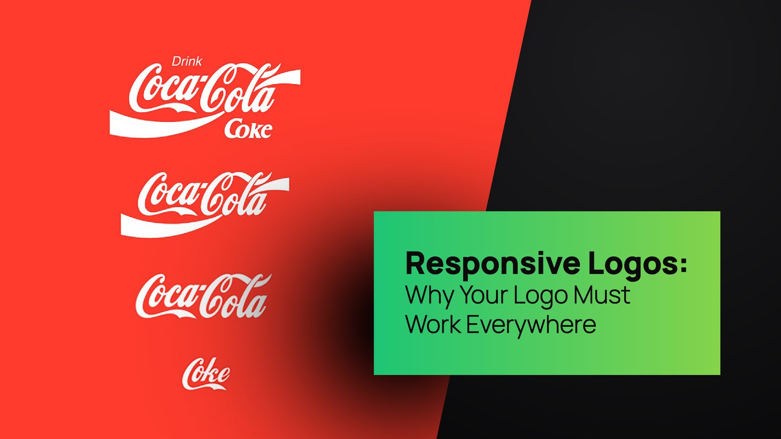
Small business logo design mistakes often involve skipping the vector stage. That JPEG you made in Canva? It’s not going to look sharp on a billboard, T-shirt, or even your email signature.
The fix? Scalable vector formats and smart typography. That way, your logo looks just as powerful on a business card as it does on a storefront. At Thinkster, we create logos that scale like your revenue—from scrappy startup to global brand.
Overcomplicating the Message
Is your logo saying “innovative tech-forward minimalist”? Or is it saying “I made this in a rush between Zoom calls”?
Trying to do everything in one logo is like trying to bake a cake with 10 flavors. It sounds exciting, but it turns into chaos. One of the biggest logo design mistakes is forgetting the core function: recognition. Your audience should get it in one glance.
Clarity over complexity. Every. Single. Time.
Ignoring Your Target Audience
You’re not designing for yourself. Harsh, we know. But true.
A massive logo design pitfall is letting personal preference guide design decisions. You like dragons? Cool. But unless your brand sells dragons, your logo shouldn’t feature one.
At Thinkster, we always ask: Who’s the audience? What are their expectations? What style earns their trust?
Designing for your audience isn’t selling out—it’s smart branding. Speak their language, visually.
No Variations? Big Mistake.
Think your logo will always live in the top-left corner of a website? Think again.
What about social media avatars? Mobile headers? Print ads? Mugs? (Yes, branded mugs still matter.)
Logo mistakes to avoid include not having horizontal, vertical, icon-only, and monochrome variations. Thinkster delivers every logo with this ecosystem built in. Because flexibility is power—and branding happens everywhere.
Trusting Uncle Raj to Design It
Ah yes, the classic “my nephew is good with computers” route.
Spoiler alert: being good at Photoshop doesn’t make someone a logo designer. Logo design tips for small business #1: hire a pro who understands brand strategy, typography, scalability, and visual storytelling—not just someone who can trace your idea into Illustrator.
Trust us. You’ll spend more fixing a bad logo than creating a good one from scratch. With Thinkster, you get it done right the first time.
When in Doubt, Call Thinkster
We’re not here to scare you—okay maybe a little. But only because we care.
Logo design isn’t just about looking good. It’s about communicating identity, values, and credibility in one clean swoop. And every time you fall into one of these logo design mistakes, you risk weakening your brand foundation.
But that’s where we step in. At Thinkster, we craft logos that hit different. Our designs are clear, scalable, audience-ready, and brand-aligned. No fluff. No fluff-ups.
Need proof? Check out our Logo & Brand Identity Design service. Or explore our Brand Guidelines packages that ensure your logo works like a well-oiled machine across every touchpoint.
Final Word: Your Logo Is Not “Just a Logo”
It’s your handshake. Your vibe. Your story in one glance.
If your current logo has any of these symptoms—font chaos, color overload, pixelation, or a pineapple lock—it’s time for a rethink. Better yet, a Thinkster.
Let’s design something unforgettable. Let’s fix what’s broken. And let’s make sure your brand walks into the room with confidence.
Logo design mistakes? Not on our watch.


