In a world where attention spans are shorter than a TikTok, your brand’s first impression matters more than ever. And what makes that impression stick? Yep, your logo. Now, the real question is—should you go big and bold or strip things down to the bare essentials? Is minimalist logo design just a passing trend riding the Instagram-aesthetic wave, or is it a timeless visual investment that screams class, clarity, and confidence?
Let’s dive deep (but make it fun) into why the design world can’t get enough of minimalism—and why Thinkster thinks your next logo should wear less and say more.
When Less Says More: The Rise of Minimalist Logo Design
Once upon a time, logos were like overly excited party guests—loud, colorful, and trying too hard to be noticed. But now? The coolest brand in the room is wearing black, sipping cold brew, and letting its vibe do the talking.
Minimalist logo design didn’t just fall from the creative heavens one fine day. It evolved. It matured. It Marie-Kondo’d its way into modern branding, saying goodbye to gradients, shadows, and overly complex shapes. Instead, it gave us clean lines, bold typography, and negative space that actually works harder than the average intern.
From Apple to Nike, some of the world’s biggest brands are rocking minimalist logos—and they’re not just doing it for the aesthetics. They’re doing it because it works. It’s sleek. Scalable. Easy to recognize at a glance. And that’s the point, right?
But Is It Just a Phase? The Trend Talk
Like any trend that floods Pinterest boards and design moodboards, minimalism has its critics. Some say it’s a phase. A design diet gone too far. A Gen Z rebellion against the ‘90s chaos. But let’s be real—trends fade when they stop serving purpose. And minimalism? It’s got plenty of purpose.
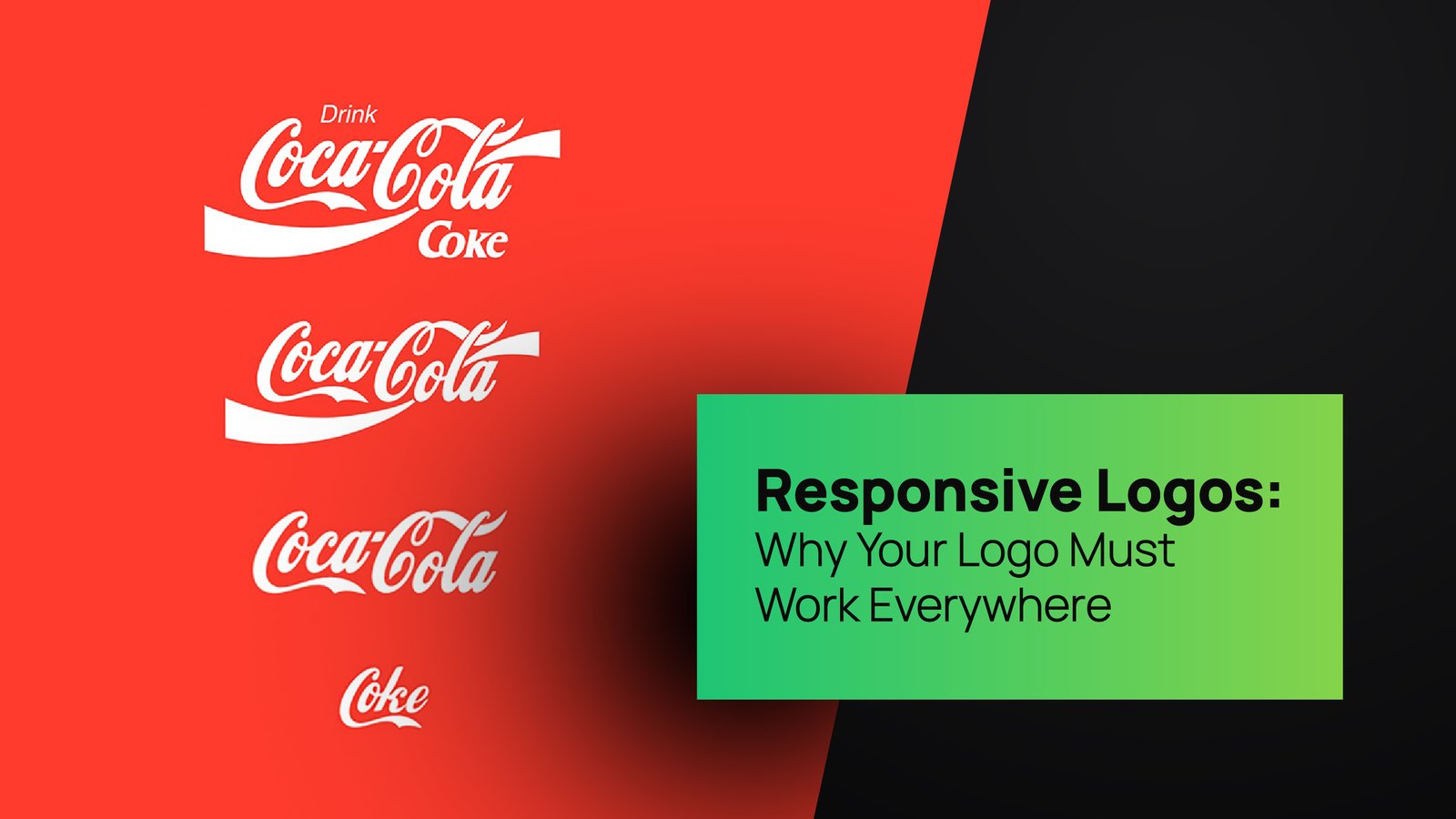
In a world where your logo has to look good on everything from an Apple Watch screen to a billboard in Times Square, simplicity isn’t just pretty—it’s practical. Try fitting an overly detailed crest onto a mobile favicon. Go ahead. We’ll wait.
Minimalist logos are flexible. They scale. They translate across cultures. They don’t rely on color crutches or Photoshop flair. They cut straight to the essence of your brand—something every business owner secretly (or not-so-secretly) craves.
What Makes a Logo Timeless?
Here’s the thing about timeless logo design: it’s not about what’s trending today. It’s about what will still look fresh when we’re all wearing AR glasses and commuting via hoverboard. A timeless logo doesn’t just survive design trends—it transcends them.
Minimalist logo design has the uncanny ability to live beyond trends because it’s rooted in clarity, not clutter. It doesn’t date itself with too many stylistic cues. Instead, it captures the core of a brand and wraps it in a visual identity that just makes sense. No fluff. No filler.
Thinkster’s take? We believe a well-crafted minimalist logo is the Little Black Dress of branding—always appropriate, always powerful, and always turning heads without yelling for attention.
Branding Strategy 101: The Logo Is Just the Beginning
Let’s pause for a hot sec—because logo design isn’t the whole brand, but it’s the handshake that starts the conversation. A great logo anchors your branding strategy. It sets the tone. It tells your audience, “Hey, we know who we are—and you should too.”
Minimalist branding takes this even further. It isn’t about being boring. It’s about being intentional. It strips away the noise and focuses on the message. That means typography with personality. Color palettes that whisper instead of shout. Negative space that breathes rather than suffocates.
At Thinkster, our branding strategy is simple: create visuals that are loud in meaning, not in mess. Whether it’s a full brand identity suite or just a logo, we help businesses (like yours) stop blending in and start standing out—with style.
Business Logo Design: Why Simpler = Smarter
If you’re a business owner, here’s what matters to you: visibility, recall, and versatility. Your logo should work as well on a packaging label as it does on your Instagram profile. And guess what? A minimalist logo delivers exactly that.
Business logo design isn’t about checking boxes—it’s about creating something that reflects your values, your goals, and your vibe. Clunky, overcrowded logos feel outdated. They signal indecision. A minimalist design, on the other hand, tells the world: “We’ve got our act together.”
Think of it as your brand’s elevator pitch—delivered visually. No extra words. No visual clutter. Just you, distilled into a mark that sticks.
Custom Logo Design: Minimalism Meets Personality
“But won’t minimalist logos all start to look the same?”
Good question. Lazy design? Sure. It can lead to a sea of sameness. But custom logo design—especially when done by the geniuses at Thinkster—is where minimalism gets its magic back.
Minimal doesn’t mean generic. A custom minimalist logo balances restraint with distinctiveness. It finds the sweet spot between simplicity and uniqueness. Thinkster’s designers obsess over that balance like it’s a matcha recipe—because that’s where the true power of minimalist design lies.
We’re not here to recycle Pinterest templates. We’re here to create your brand’s fingerprint—clean, clever, and 100% yours.
Minimalist Logo Design in Action: Real-World Wins
Let’s look at some logo glow-ups. Big brands are simplifying, not complicating:
- Mastercard dropped the text and doubled down on its iconic overlapping circles.
- Pringles flattened its cartoon mascot for a bolder, modern vibe.
- Google moved from serif to sans-serif, keeping its playful colors but giving us a grown-up version of its identity.
What do all these have in common? Minimalist redesigns that didn’t lose brand equity—they elevated it. It’s the kind of strategic visual evolution we live for at Thinkster.
Whether you’re a startup founder or a seasoned business mogul, these are lessons worth stealing.
Why Thinkster Is Obsessed with Minimalist Branding
We get it—minimalist branding is kind of our thing. But that’s not because it’s trendy. It’s because it works.
At Thinkster, we help businesses craft smart, scalable identities that punch above their weight. We believe in form meeting function and then shaking hands with fun. Our design philosophy is equal parts creative freedom and ruthless editing. If it doesn’t serve the message, it gets cut. That’s how great design works.
Minimalism, for us, is a tool. A weapon. A silent amplifier of what your brand stands for. And our job is to wield it well.
So… Is Minimalism Here to Stay?
If you’ve made it this far (you rock), here’s your answer: Minimalist logo design is not just a trend. It’s a branding power move. It’s thoughtful. Intentional. Strategic. And best of all? Timeless.
Sure, styles evolve. Fonts get cooler. Platforms change. But the need for a clear, distinctive, and memorable logo? That’s eternal. Minimalism simply answers that need in the most elegant way possible.
And with Thinkster by your side? You’re not just following a trend. You’re setting a new standard.
Ready to Ditch the Clutter?
Minimalist logos don’t mean your brand has to feel bare or boring. With the right partner (hey, that’s us!), your visual identity can be bold, refined, and unmistakably you.
If you’re rethinking your current branding or starting from scratch, let’s build a visual identity that cuts through the chaos. One that feels as good on your merch as it does in your customer’s memory.
Because good design doesn’t need to shout.
It just needs to Think.

